How to Mix Texture & Pattern in Your Home Decor
Texture and pattern are the silent architects of great interiors. While color often receives the spotlight, it is the interplay of tactile surfaces and visual motifs that creates depth, rhythm, and personality in a space. When layered thoughtfully, they transform flat rooms into immersive environments. When misused, they create visual noise.
We explores how to strategically mix texture and pattern across different rooms, materials, and scales—balancing cohesion with creativity for a sophisticated, editorial finish.
Establish a Foundation: Balance Visual Weight Before Adding Complexity
Before introducing layered patterns or tactile surfaces, the space needs structural balance. Every room benefits from a grounding element—typically neutral walls, consistent flooring, or a dominant material that anchors the aesthetic.
Start with a Neutral or Subtle Base
A calm backdrop allows patterns to stand out without overwhelming the room. This could include matte-painted walls, wide-plank wood flooring, or understated natural stone. Subtle textures such as limewash or brushed finishes introduce quiet depth without competing for attention.
Understand Visual Weight
Heavier textures—like rough stone, dark wood, or thick wool—carry more visual weight. Lightweight materials—like sheer fabrics, smooth ceramic, or pale linen—feel airy. Mixing them intentionally prevents imbalance.
For example, pairing a bold geometric rug with smooth leather seating creates contrast without clutter. The key is to let one element dominate while others support.
Layer Textures for Depth and Tile Dimension
Texture is not limited to fabric. It appears in flooring, wall treatments, furniture finishes, and decorative accents. A well-layered space includes a spectrum of tactile contrasts.
Combine Soft and Hard Surfaces
Effective layering often contrasts materials:
- Velvet with brushed brass
- Woven jute with polished marble
- Matte ceramics with glossy tiles
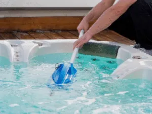
In moisture-prone areas like bathrooms, surface selection becomes even more critical. Combining matte and slip-resistant finishes with patterned detailing adds both safety and visual interest. Designers frequently recommend exploring specialized surfaces such as shower floor tile options that balance grip, durability, and aesthetic variation. Mosaic layouts, pebble textures, or small-format porcelain can introduce subtle patterns while enhancing traction.
Textured floor surfaces introduce depth and tactile interest while harmonizing with smooth wall tiles or minimalist fixtures. This creates a layered, cohesive design that feels purposeful rather than decorative. You can explore a variety of textured floor tiles through Mineral Tiles and request free samples to experience the feel, finish, and color in your space before making a final selection.
Repeat Materials Strategically
Repetition creates harmony. If a textured stone appears in one zone, echo it elsewhere in smaller doses. If a woven accent chair is introduced, consider complementing it with linen drapery or a natural fiber rug. Texture repetition establishes rhythm without uniformity.
Master Pattern Mixing Through Scale and Contrast
Pattern mixing is where many interiors either shine or struggle. The secret lies in controlling scale, spacing, and visual hierarchy.
Vary the Scale
Combining patterns of similar size often creates competition. Instead:
- Pair large-scale florals with fine stripes
- Match bold geometrics with subtle micro-patterns
- Combine abstract prints with solid color blocks
This hierarchy allows the eye to move comfortably across the room.
Anchor Bold Patterns with Structured Backsplash Materials
In spaces like poolside lounges or outdoor entertaining areas, patterned textiles and cushions can be balanced with structured architectural finishes. Reflective and patterned tile surfaces, for instance, add controlled complexity without overwhelming the design.
For exterior environments, glass finishes introduce both texture and visual movement. Designers often look to curated collections when planning statement installations, especially when selecting surfaces that interact with water and light. Curated resources to shop for glass tiles for pool applications provide insight into how reflective materials enhance pattern layering while maintaining cohesion with the surrounding hardscape.
The interplay of shimmer, grout lines, and water reflection creates a dynamic pattern variation that evolves throughout the day—subtle in the morning, dramatic at dusk.
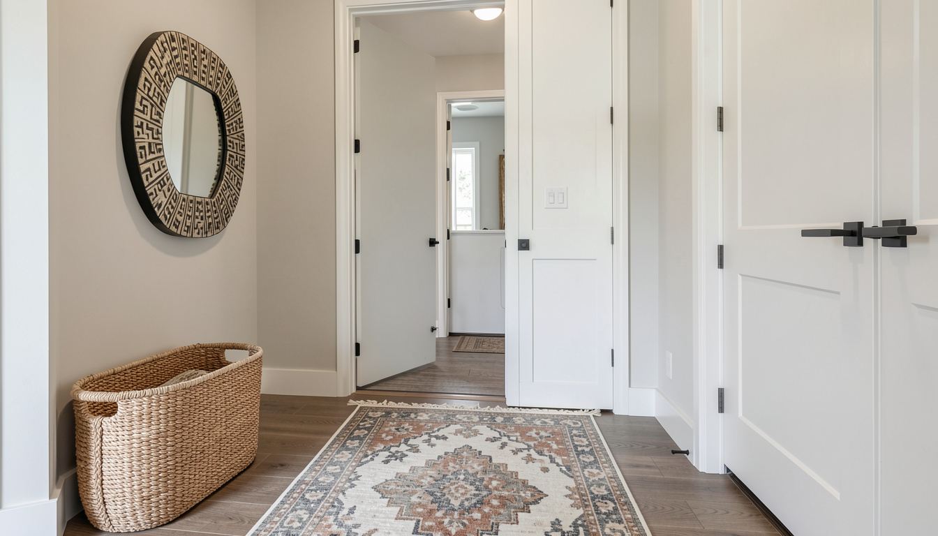
Integrate Texture and Pattern by Room Function
Each space within a home demands a tailored approach. Function influences how texture and pattern should be distributed.
Living Rooms: Layer Comfort with Structure
In social spaces, layering should invite interaction. Combine plush upholstery, textured throws, patterned cushions, and structured side tables. Rugs are particularly powerful for pattern introduction; they define zones while adding warmth.
Avoid overcrowding. If the sofa carries a bold print, keep accent chairs neutral but textural.
Bedrooms: Emphasize Soft Depth
Bedrooms benefit from tonal layering rather than sharp contrast. Mix quilted bedding, woven headboards, soft knits, and subtle wallpaper. Patterns should feel calming—think muted botanicals or delicate linear motifs.
Bathrooms: Controlled Contrast
Bathrooms thrive on material interplay. Smooth porcelain walls can contrast with textured flooring. Fluted vanities or ribbed glass partitions introduce architectural rhythm without overwhelming compact spaces.
For homeowners seeking a refined blueprint for combining tactile materials with pattern in high-end spaces, check the guide on how to design a luxury bathroom, which offers detailed insights into layering finishes, balancing sheen levels, and maintaining visual continuity. Strategic combinations—such as marble veining against matte stone or metallic accents paired with mosaic detailing—demonstrate how pattern can remain elegant rather than busy.
Functionality must always guide decisions in wet areas; durability and maintenance matter as much as aesthetics.
Use Color as the Unifying Thread
Even the most eclectic mix of textures and patterns can feel cohesive when color is consistent.
Limit the Core Palette
Select two to four primary colors and repeat them across different materials. For example:
- Navy appearing in patterned drapery, ceramics, and upholstery
- Warm neutrals tie together stone, wood, and woven fibers
Consistency in hue allows variation in surface detail.
Play with Tone, Not Just Shade
Within a single color family, incorporate lighter and darker variations. This creates depth while maintaining harmony.
Avoid Common Texture & Pattern Pitfalls
A refined interior requires restraint. Common missteps include:
- Overusing bold prints in small spaces
- Ignoring lighting (which dramatically affects texture visibility)
- Mixing too many competing motifs
- Neglecting negative space
Strategic emptiness is as important as decorative layering. Open wall space or simple furnishings provide visual rest, allowing textures and patterns to stand out meaningfully.
Conclusion
Mixing texture and pattern is less about rules and more about intentional contrast. Successful interiors balance scale, vary tactile surfaces, and unify through color and repetition. Whether layering textiles in a living room, selecting specialized surfaces for bathrooms, or integrating reflective materials in outdoor environments, the goal remains the same: create depth without disorder.
When executed thoughtfully, texture and pattern do more than decorate—they define atmosphere, evoke emotion, and transform everyday spaces into curated experiences.