How Your Home’s Palette Affects Mood and Property Value
New research shows that the colors on your walls do more than just look pretty, they can change how you feel and how much your home is worth.
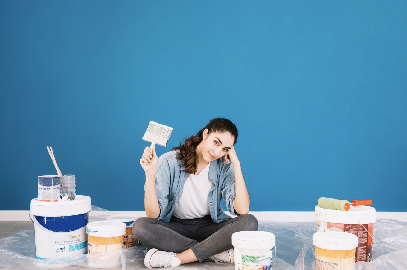
Denver, CO , When Sarah Martinez decided to repaint her home last spring, she didn’t realize she was making a decision that would affect both her daily happiness and her bank account. Like many homeowners across the country, she learned that paint color choices involve more than personal taste.
They’re decisions backed by science, psychology, and real estate data.
Scientists who study how our brains react to color have found something interesting. The colors around us actually change our emotions, energy levels, and even how we think. At the same time, real estate experts have discovered that certain paint colors can add thousands of dollars to a home’s selling price. This combination of mental health benefits and financial gains has turned paint selection into a topic that homeowners are taking more seriously than ever before.
What Scientists Say About Color and Mood
Dr. Angela Wright, a leading color psychologist, has spent over thirty years studying how colors affect human behavior. Her research shows that our brains respond to colors in predictable ways, no matter where we live or what culture we come from.
“Color is light energy, and our eyes send that energy directly to our brain,” Dr. Wright explained in a recent interview. “Different wavelengths of light trigger different responses in our nervous system.”
Blue, for example, actually slows down our heart rate and lowers blood pressure. That’s why hospitals often paint recovery rooms in soft blue shades. Studies at universities have found that people working in blue rooms solve problems more easily and stay calmer under pressure.
Red does the opposite. It speeds up our heartbeat and increases energy. Restaurants sometimes use red in their dining rooms because research shows it can increase appetite. However, too much red in a bedroom can make sleep more difficult.
Yellow stimulates the part of our brain responsible for happiness and optimism. But there’s a catch. While soft, warm yellows can make people feel cheerful, bright or harsh yellows can actually increase anxiety. Scientists at the University of British Columbia found that people in bright yellow rooms showed higher stress levels than those in rooms painted with gentler yellow tones.
The Real Estate Numbers Tell a Story
Paint color doesn’t just affect feelings, it affects finances. According to Zillow’s 2024 Paint Color Analysis, which examined over 135,000 home sales across the United States, certain exterior and interior colors consistently help homes sell faster and for more money.
Homes with exteriors painted in shades of charcoal gray or slate blue sold for an average of $6,500 more than expected. Properties with warm gray or greige (a gray-beige blend) interiors received offers that were $3,900 above similar homes with pure white walls.
“Buyers today want move-in ready homes that feel modern and thoughtfully designed,” said Marcus Chen, a real estate agent with fifteen years of experience. “Neutral doesn’t mean boring anymore. It means sophisticated colors that appeal to a wide range of people.”
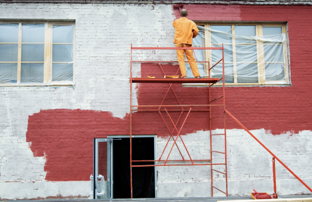
Interestingly, some popular colors actually hurt home values. Homes with bright red exteriors or bold purple accent walls sold for thousands less than comparable properties. White or cream exteriors, once considered safe choices, now test as outdated and sell for less than homes with contemporary gray tones. Services like Exterior Home Painting Denver have reported increased requests for these modern gray and blue-gray color schemes as homeowners prepare their properties for sale.
Different Rooms Need Different Approaches
Professional interior designers recommend thinking about how each room in your home gets used before choosing its color.
Bedrooms benefit from cool, calming colors. Soft blues, gentle greens, and lavender all help people relax and sleep better. A British study tracked sleep quality in 2,000 homes and found that people with blue bedrooms got an average of seven hours and fifty-two minutes of sleep per night, the most of any color group.
Living rooms should welcome conversation. Warm neutrals like tan, beige, and soft gray create comfortable spaces where people want to gather. These colors don’t compete with furniture or artwork, making rooms feel balanced and peaceful.
Home offices need focus-friendly colors. Light greens and soft blues help concentration and productivity. A Texas research team discovered that workers in green offices completed tasks 12% faster than those in white offices.
Kitchens work best with appetite-friendly colors. Warm whites, soft yellows, and light earth tones make kitchens feel clean and inviting. These colors also photograph well, which matters when selling a home since kitchen photos often determine whether buyers schedule a viewing.
Bathrooms should feel clean and spa-like. Soft blues, sea greens, and crisp whites create a fresh, sanitary feeling. These colors also make small bathrooms feel more spacious.
The Undertone Secret
Here’s something that surprises many homeowners: most paint colors have hidden undertones that only show up on your walls.
Paint store samples look different under your home’s specific lighting. A gray that looks perfect in the store might turn purple on your wall if it has blue undertones. A white might look pink or yellow depending on its undertone and your room’s natural light.
Professional color consultants recommend a simple test. Buy small sample pots of your favorite colors and paint large poster boards. Move these boards around your room throughout the day. Check how they look in morning light, afternoon sun, and evening lamp light. The color that looks good in all three lighting conditions is your winner.
Time of day matters more than most people realize. North-facing rooms get cooler, bluer light all day long. South-facing rooms receive warm, golden light. East-facing rooms are bright in the morning but darker in the afternoon. West-facing rooms do the opposite. Understanding your room’s light helps you choose colors that will look right when you’re actually using that space.
The Financial Investment of Quality
While paint might seem like a simple purchase, quality makes a significant difference in results and longevity.
Consumer Reports tested fifty different paint brands and found that premium paints covered better, lasted longer, and resisted fading more effectively than budget options. The price difference often means buying one gallon of premium paint instead of two gallons of cheap paint, making the actual cost similar.
High-quality paints also contain more pigment and better binders. This means richer, truer colors that don’t fade quickly. It also means fewer coats needed for full coverage, which saves time and labor costs.
For homeowners planning to sell within five years, investing in quality paint is particularly smart. The improved appearance helps during showings, and the better durability means the paint still looks fresh when listing photos are taken.
Current Color Trends for 2025
Design experts have identified several color trends gaining popularity this year.
Warm neutrals are dominating. Greige, warm grays, and soft taupes continue their reign as America’s favorite paint colors. These shades work with any decorating style and appeal to the widest range of buyers.
Nature-inspired greens are growing. Sage green, moss, and olive tones bring outdoor calm inside. These colors test well with buyers seeking peaceful, organic-feeling homes.
Soft, dusty blues remain strong. Not the bright blues of previous decades, but muted, sophisticated blue-grays that feel both modern and timeless.
True white is making a comeback. After years of beige and cream dominance, crisp white is returning for trim, ceilings, and modern spaces. However, designers recommend pairing it with warmer wall colors to avoid a cold, sterile feeling.
Making Your Decision
Choosing paint colors doesn’t need to feel overwhelming. Start by collecting images of rooms you love. Notice patterns in your choices. Do you gravitate toward cool or warm tones? Bright or muted shades? These preferences reveal your natural color personality.
Consider your home’s permanent features. Your flooring, countertops, and cabinets aren’t changing, so your paint needs to work with them. Bring home samples and compare them directly to these fixed elements.
Think about your goals. Are you painting for your own enjoyment or preparing to sell? If you’re staying, choose colors you love. If you’re selling soon, lean toward those proven neutral tones that add value.
Finally, remember that paint is one of the most changeable aspects of your home. Unlike new floors or countertops, repainting is relatively affordable and quick. This means you can take some risks and have fun with color. If you don’t love it, you can change it.
The colors surrounding us every day shape our moods, influence our behavior, and even affect our home’s market value. Taking time to choose wisely means creating a space that not only looks beautiful but actually makes life better, and protects your financial investment at the same time.